Monday 1 October 2012

Promotional Material//Poster

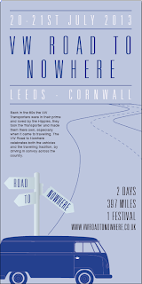
Again with the poster i wanted it to look and fit in with the other promotional material products, so i have used the same style and colours to create the design. With this poster i wanted to use a different format to normal so i have done it at a 2:1 ratio, making it a tall and thin poster. I used the same sign post and VW transporter.


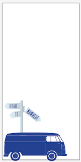
The initial start to the poster, positioning the transporter and the signpost, the two elements i have used across all 3 formats.

Adding the main title to the poster, this time i used the name aswell as the signpost to make sure it was known what the event was. 

Adding the other information around the title, main information of the event. This balanced out the title and made that section of the poster stand out and catch your eye the most.

From the publication i did previous i wanted to use the same colours so i brought in the reddy/pink on the important information to make that different to the title, but im not sure weather it works as it is quite light and doesnt stand off the page that well.

Within the poster, i wanted to illustrate the fact that it is a convoy across the country and i thought adding in the road would show this best. keeping it to the right hand side, still left room to add extra information about the event.


Finally i added in the rest of the information, the top section is some background info about the event and why it was being held, the other information is straight to the point about the event.
I also added the background colour because it was looking a little bland, but as you can see the date and place on the title now doesnt really work or stand out anymore.


To address that factor i changed the pink back to white and now it works much better and reads better. 


Promotional Material//Mail out

For the welcome pack i wanted to do something different to that i have done before, this started off with being the design for the flyer, but i thought it best suited the welcome pack and the idea behind it also fit better with this.
It will be a mail out pack which includes all the information needed on times, dates, place, price, information on the festival and stalls etc.

The welcome pack is in two parts, theres the envelope (which also acts as part of the design for the welcome pack) and the small publication for the info inside.


Initial idea, which was quickly drawn out digitally.


Tidying up the design and making everything fit within the space, 


After tidying up the design i corrected the sign post to make it all equal and then added the colour, shadow and the event name within it.


The bottom half of the design will be the address area which will fold in half to make the wallet section for the leaflet to slide in.

The blank square on the front of the design is where the leaflet will slide in, through the front of this you will see the front cover of the leaflet. The leaflet will include information on dates, places, where, prices, background information and more info on the festival on the sunday.


Leaflet design

insert here.

Promotional Material//Flyer

For the flyer i wanted to create something that was simple but caught your eye. I wanted to put on some background information and the important info, but then leave the rest as this would be on the website or in a leaflet form.


Using the same as the welcome pack with the sign post, as i want them to be all in keeping with them. The VW obviously to show what the event is about without having to write 'VW' on it. Once printed the flyer will be cut out to the outline shape, to make it different and to stand out more. 


Adding in the information to the flyer, the date and place as this is the most important information needed.


Lastly the finished flyer with all information added. The top section is very brief background info to the event. The bottom information is more about the event and then price information and directing to the website.

I am still not 100% sure about the bottom information section as it doesn't sit the best on the flyer. It makes the bottom half of the flyer look unbalanced, so i may re-work that section of it.

Promotional Material//What its for

When researching into my chosen subject initially, i found that the VW transporters were part of alot of different cultures, in some being the cult symbol for them; hippy and sufer/skateboard. This was because the vehicles were so easy to run, easy to repair and offered alot of room for transporation but also for long journeys and staying over in the vehicle on the travels.
The idea of travelling and using the vehicle as a 'home on wheels' was where i got my idea for the event from. When travelling especially when you have no given destination, its like you are on the 'road to nowhere', it doesn't matter where you end up or stay because there is no set places to reach.
The name of the event 'road to nowhere' came from this idea and the event is based around that too. It would be a sort of convoy in which enthusiasts would meet at a given place and then travel all together for a certain distance to them reaching a open grounds to which a day festival would happen.
The idea is to take the idea of the festivals that happen today that celebrate the life of the VW transporters but then also add in this idea of travelling like the hippies and sufers used the VWs for.

The promotional material that i am going to make for this is:
- Poster - this will be A3 sized at a 2:1 ratio (42x21cm)
- A5 flyer
- Welcome pack

All the promotional will be in keeping with the publication i created throughout the summer, to make it a full body of work.

Presentation & feedback

For the presentation we were split into small groups of 5 and presented within the groups to each other. This gave us a much more personal touch to the feedback and i found it a much easier setting to be doing a crit in, especially when i was wanting some good feedback i could use against my work to improve it. It was a good introduction back into doing crits.

Positives:
- Good primary research
- Trip to VW events were of good use
- Thorough secondary research
- Great presentation - innovative use of gif image
- Final products well printed and finished to a very high standard
- Good attempt on binding technique for first time of doing it
- Illustrations and Editorial were amazing
- Good interest within topic
- Final product brilliant, well informed and great quality of photography
- Great primary research
- Good product research
- Shown process taken well
- Moving imagery on slides works well whilst were talking - keeps interest in presentation
- Strong final product
- Good primary imagery

Constructive:
- Front cover could do with larger VW association so can be easily recognisable
- Check spelling and proof read
- Watch paragraph lining on main body
- Align titles/body copy within spread to balance out


I am very happy with the feedback that i got from my group and it made me feel like it was worth all the work i put into the project over the summer. The positive feedback was very good and i appreciate all the good things that were said about my work. For the negatives they were all things i knew about myself. With the front cover i was going to laser cut out a VW transporter onto the front over but i ran out of time to do this process. For the spelling i was aware of the mistakes once i had printed the booklet, which was too late.
These small constructive comments are good for me and are the smaller things that i need to look at when designing to get my work up to that high end standard and make it the best it can be.
This crit did definitely help with that and i found it very useful.

Thursday 20 September 2012

Wednesday 19 September 2012

A History of//Digital Publication

Along the way of designing the publication I have been creating a full digital version of the publication, this is mainly to aid presenting the publication to an audience, but also so it can be viewed online.